Overview
Challenge
The existing Eagle Magazine website suffered from several critical UX issues. Content was disorganized, making it difficult for users to find desired articles. Overwhelming visuals and inconsistent layout created a confusing user experience. The subscription process was unclear and poorly positioned. The website had poor SEO, resulting in low organic traffic.
These factors contributed to a declining subscriber base and overall user dissatisfaction.
Solution
User Research and Analysis

Name: Delphine Hodges
Age: 42
Occupation: Store Manager
Characteristic: Regular reader seeking up-to-date news.
Goals: Stay updated on the latest happenings around the town, and connect with a community of like-minded individuals.
Challenges: Limited time to sift through vast amounts of information, prefers intuitive website navigation.

Name: Matt Cerson
Age: 28
Occupation: IT Professional
Characteristic: Interested in exploring diverse content.
Goals: Often read and stay updated with the newest articles, like to share and invite his friends to participate or visit local events, fair and exhibitions.
Challenges: Limited time to sift through vast amounts of information, prefers intuitive website navigation.
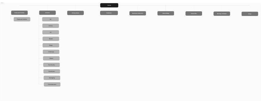
Information Architecture Optimization
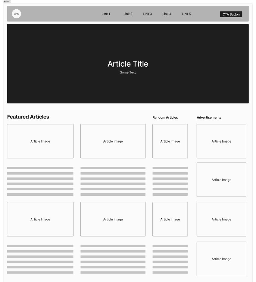
Wireframe

Visual Design and User Experience

Result
The results were nothing short of extraordinary. Not only did the website become a visual delight, but it also transformed into a powerful tool for attracting and retaining readers. Subscriber numbers soared by 15%, and organic traffic experienced a remarkable 27% growth. It was a testament to the power of design when it’s rooted in understanding the user and their needs.
This project was more than just a redesign; it was a revitalization. Eagle Magazine had found its digital voice, and it was a resounding success.


