Challenge
The challenge was to create a landing page that not only captured attention but also effectively converted visitors into customers.
Task
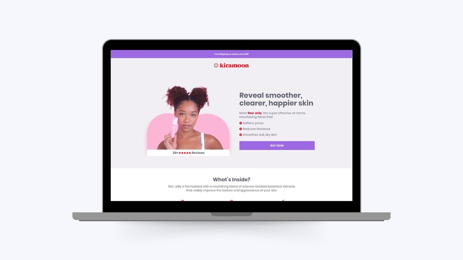
The core design principle was to create a visually appealing yet uncomplicated page that focused on the product and its benefits. The goal was to minimize distractions and guide users towards a clear call-to-action (CTA).
Project Execution
As a designer I collaborated with the team members to create the high-conversion optimized landing page and after brainstorming with the team we decided to design a page that has minimalist design, high quality imagery, clear and concise copy, prominent call-to-action, social proof and limit the distraction to maintain the focus on the product and engage visitor to click on the ‘Buy Now’ button.
After creating several versions with reviews and feedback a landing page was ready and everyone in the team was excited to test this landing page.
To refine the page’s effectiveness, A/B testing was conducted on different design elements, including – Headline variations, CTA button placements, image variations, and color schemes.
Result
By implementing these design strategies, the Star Jelly landing page achieved a remarkable 27% click-through rate on the “Buy Now” button. The minimalist yet engaging design, combined with clear messaging and compelling visuals, effectively guided users towards a purchase decision. The success of this landing page demonstrates the power of a well-executed design in driving conversions and achieving business objectives.


