Main Objectives
QS Top Universities current website is a primary tool for the potential students (their primary users). QS ensure student candidates have access to helpful tools and the latest independent data and insights so they can make informed decisions about their education.
Hence the objectives of the QS Top Universities website redesign to enable students browse the website easily, find the relevant information quickly and enable students make actions/decisions on the homepage like ‘Signup’, ‘Subscribe’ ‘Show Interest’ or ‘Contact’ through a form that would capture the student details with their consent and QS team would help students to find the top courses in top universities to enable motivated people anywhere in the world to fulfil their potential through educational achievement, international mobility, and career development.
Challenge
Improve the user experience of students interacting with the website. Current website is somewhere lacking at providing all the relevant information. The structure of the home page needs to be reorganized in way that it creates trust and improve credibility among the students. Students these days are easily influenced by others so they can not make decisions easily so the overall design of the website should appeal students and they should be able to make decisions by getting all the key information they are looking for.
Key Points for the Website Redesigning
- Improve the overall site architecture and navigation
- Remove all the irrelevant content and information, to get out there a crisp and clean content.
- Enhance the brand identity to improve the credibility and trust.
- Modern interface design with a touch of conventional touch, which visually looks appealing to students and encourage them to make decisions.
- Improve the overall site architecture and navigation
Target Users of QS Website
- Students looking for higher education
- Job Seekers who are looking for a change in Career by upskilling
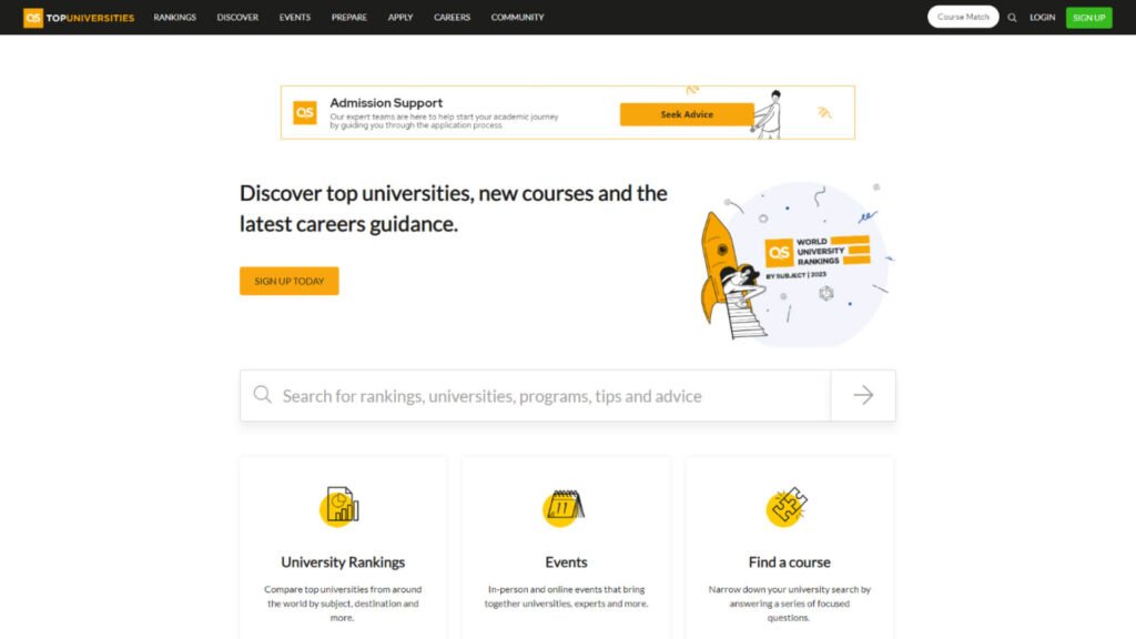
Current User Interface
User Research
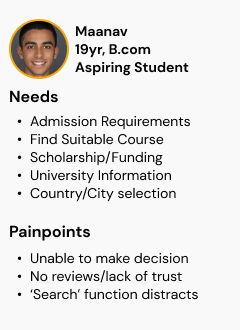
User Personas

Positive Insights
- Students visit the website to find suitable courses, scholarships and universities ranking.
- They like the ‘Admission Support’ feature on the home page
- Students find it easy to ‘search’ for the information regarding courses, universities, scholarships, etc. on the on the home page
- People who are looking to change career path by upskilling find this website helpful.
- They do feel motivated to see handful information all together on the homepage.
Negative Insights
- The homepage is not students focused, students find it like a blog site, nothing much%
- Students find it difficult to see the key information on the homepage.
- ‘Search’ is good but its a 3 layer of clicks that makes users annoyed and it should be prominent on top
- Very few CTAs that does not encourage students to click and explore the website in detail%
- Students don’t see the information that motivates them to take decisions on the home page.
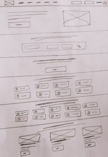
Paper Wireframe for quick ideation
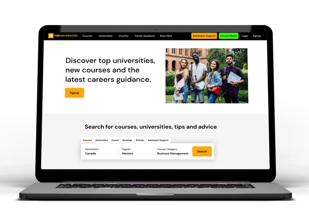
Proposed Design Solution
Result
I had a great time working on this project. New design looks promising for students, they are able to find courses, universities and other key information on the home page and the website is engaging students to make actions. Students feel excited and satisfied to see a the home page is serving their needs.
- New Website increased engagement rate by upto 37%
- Students are now encouraged to click on 'Call To Action' buttons throughtout the page and it helped the company to increase the conversion rate by upto 49%.

